Pier Coffee Co. Brand Identity – 2025
At the heart of Pier Coffee lies its defining statement
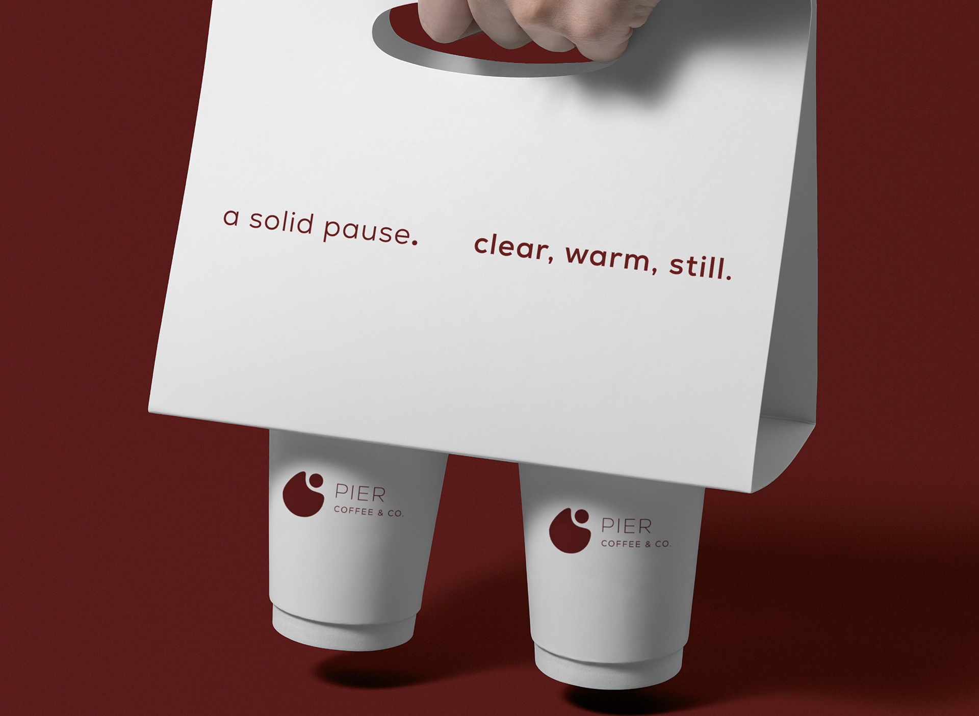
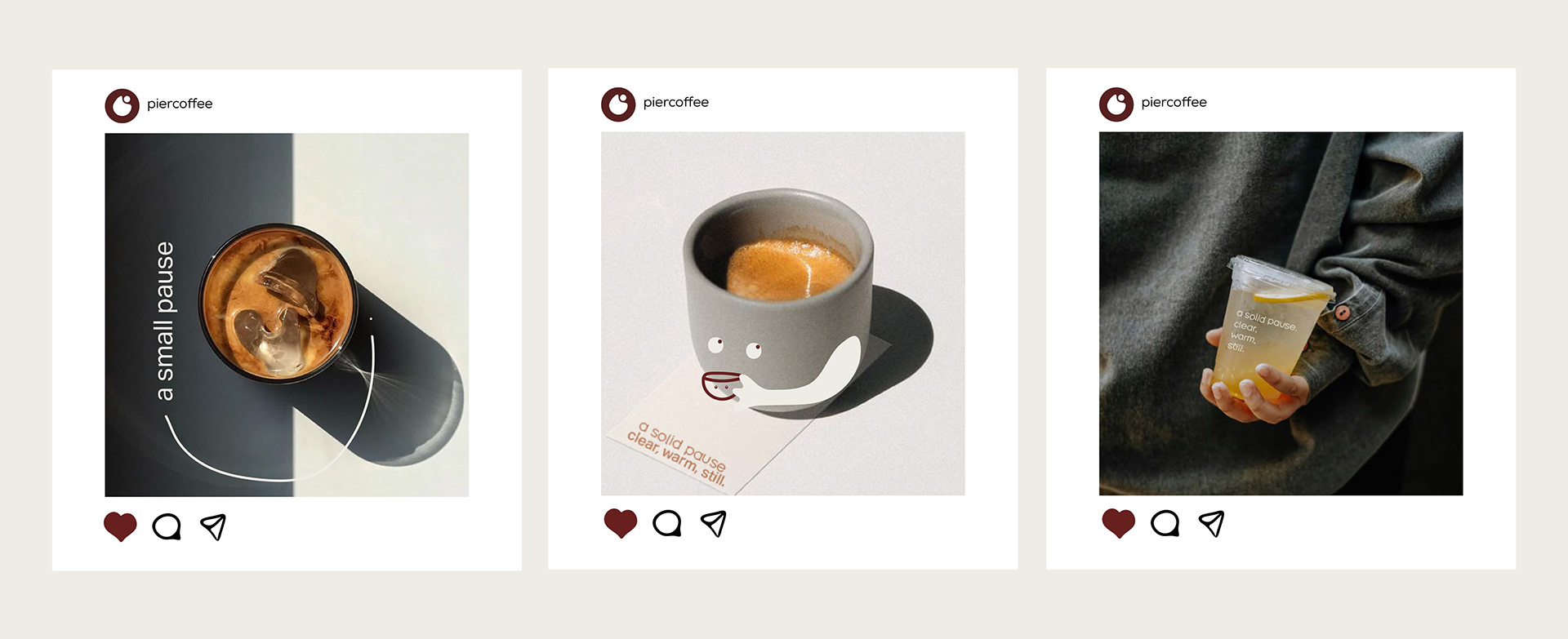
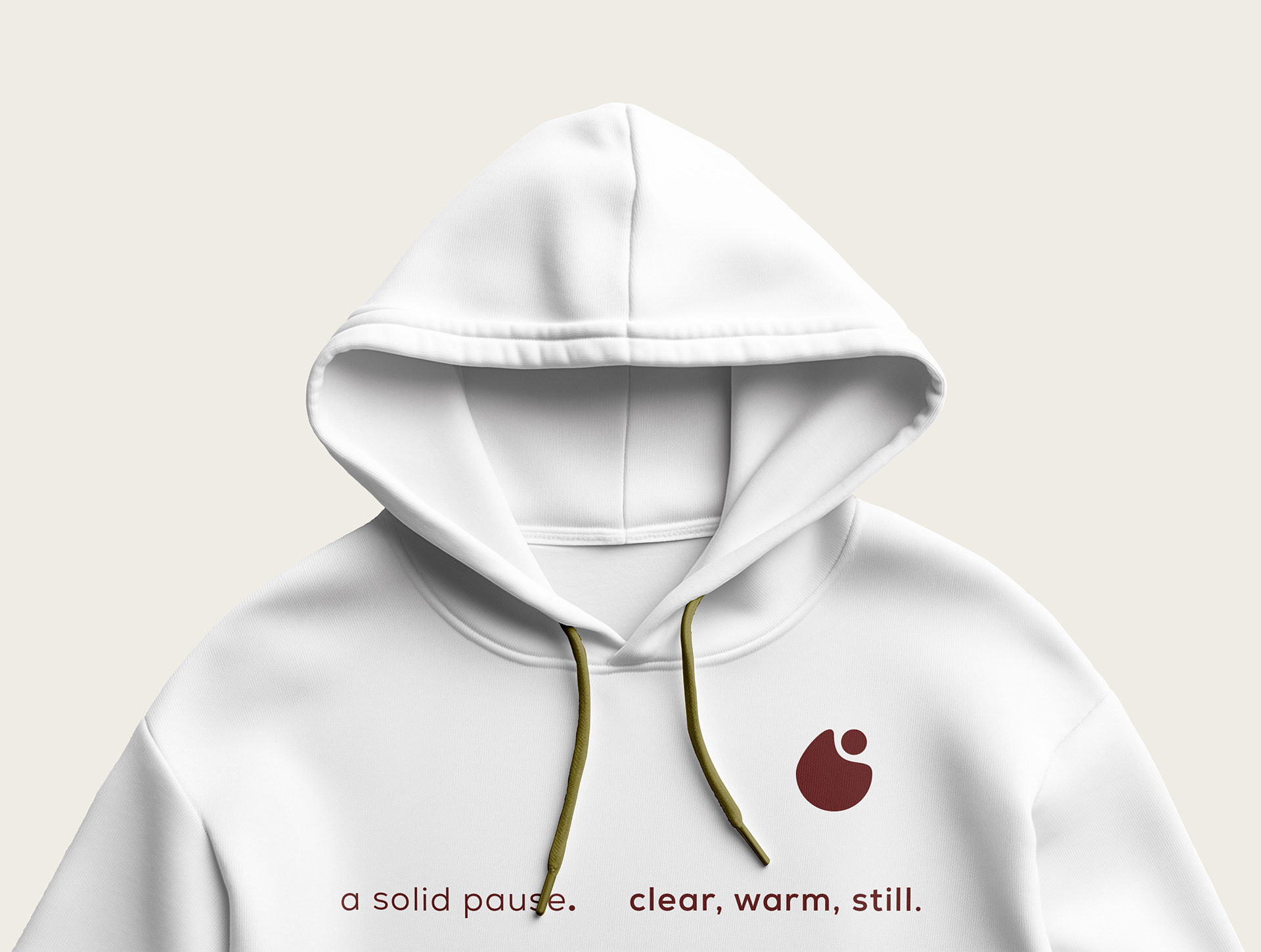
“a solid pause — clear, warm, still.”
This slogan encapsulates the brand’s promise —
to offer a grounded moment of stillness within the daily rush.
“Solid” reflects the reliability and intention behind every product;
“clear” speaks to the visual and emotional transparency of the brand;
“warm” conveys its approachable,
human tone; and “still” evokes quiet moments of presence.
This line serves not only as a tagline, but as the foundation for
the entire brand language and design system.

The Pier Coffee branding project encompassed
the full development of the brand’s visual and verbal identity.
Beginning with core positioning and concept exploration,
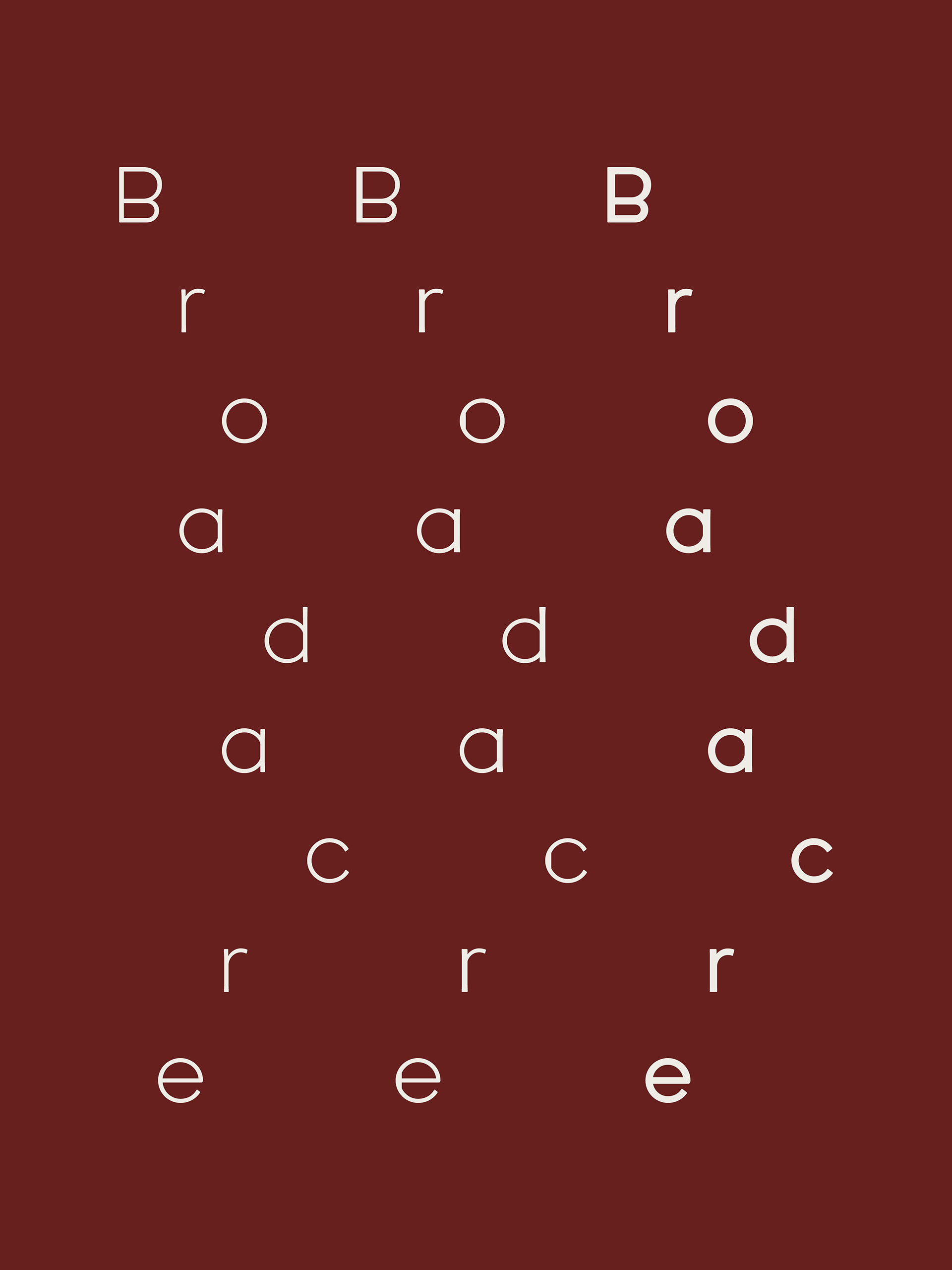
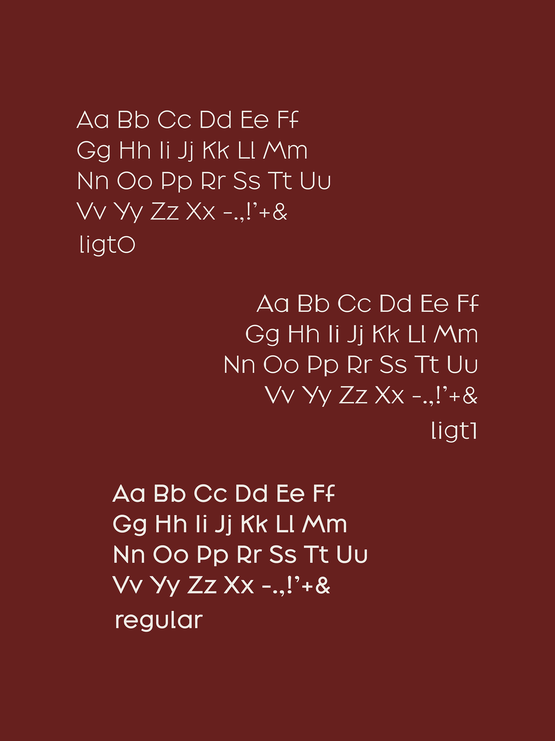
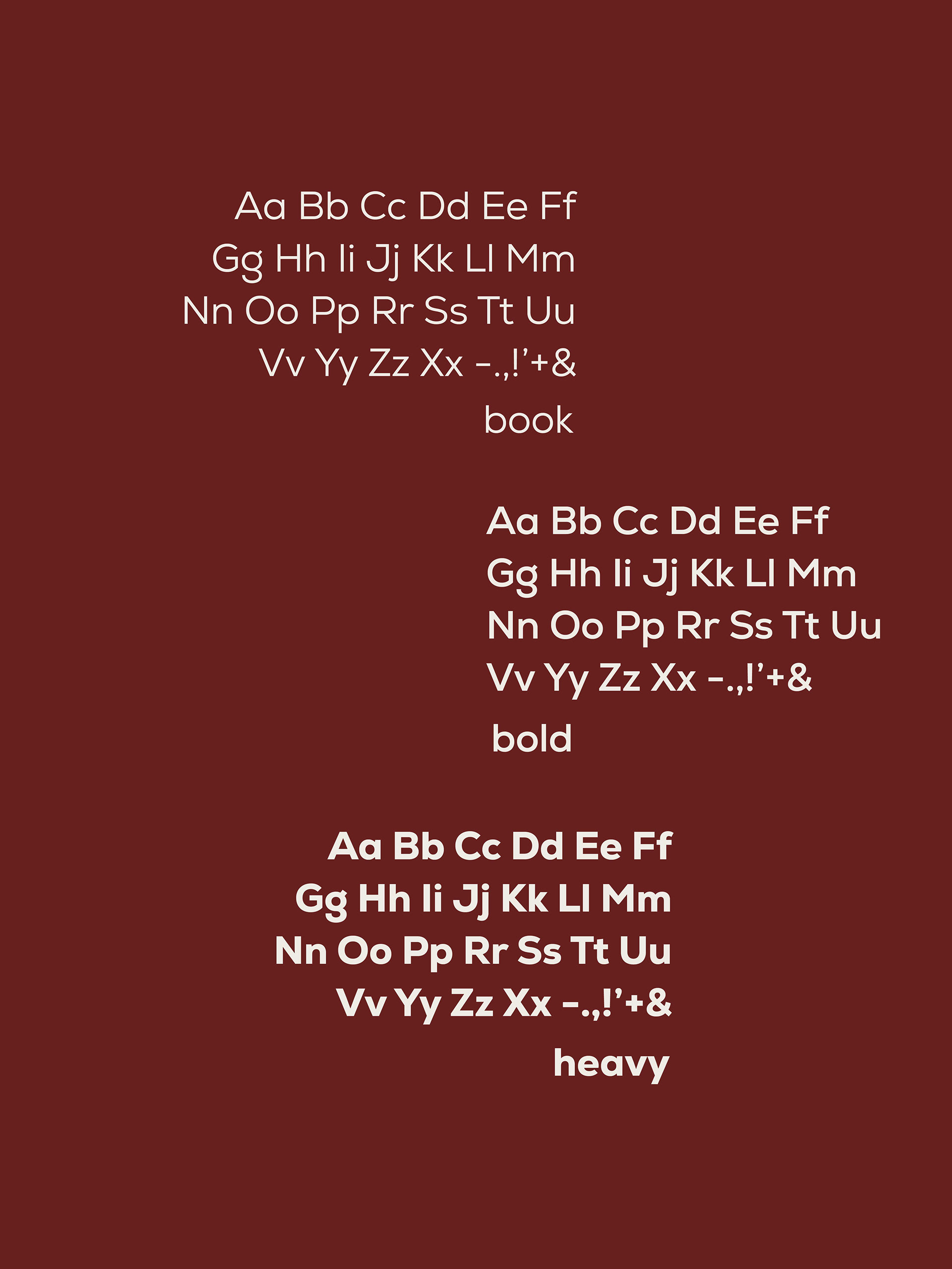
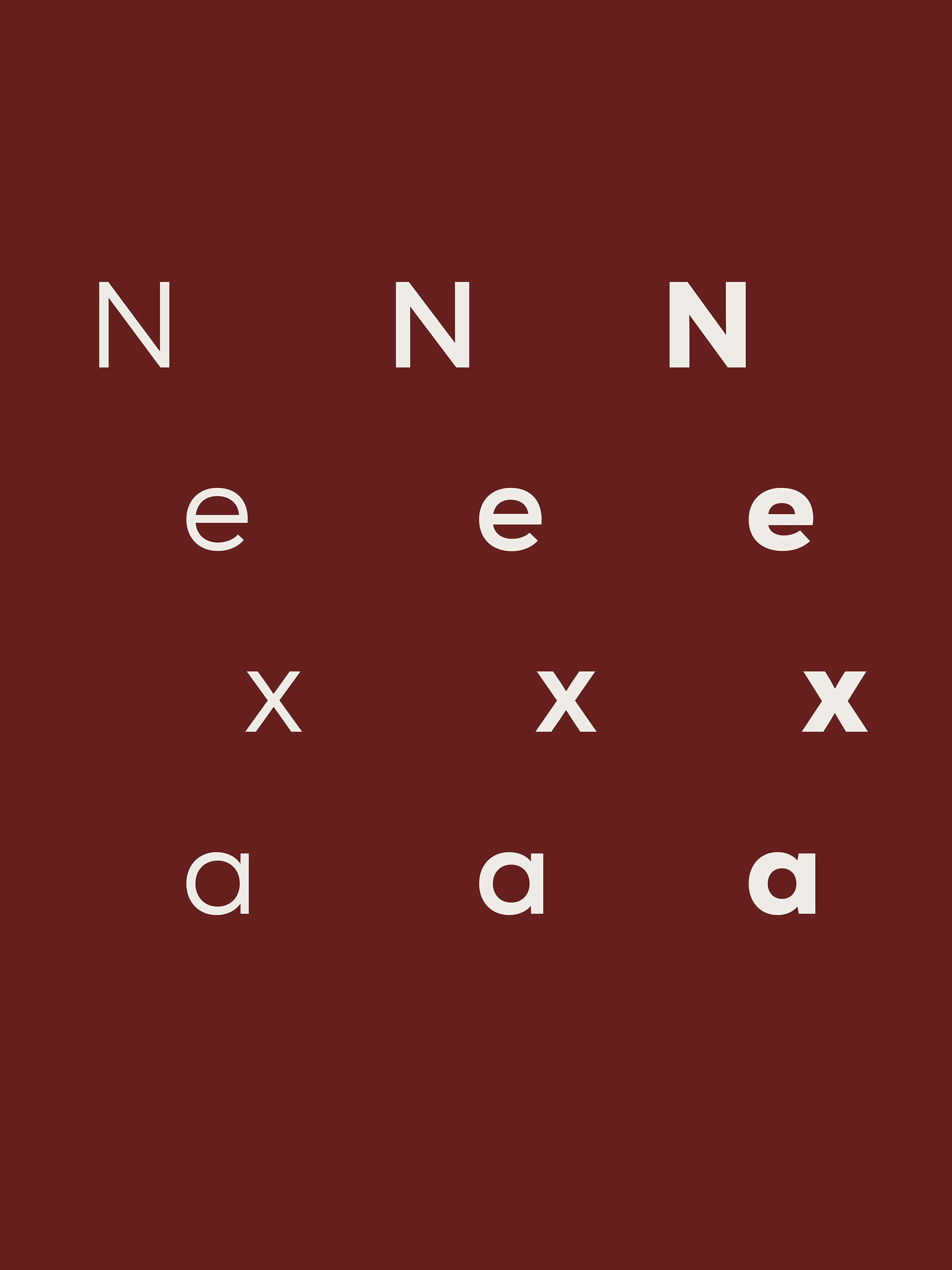
the process extended into logo design, typography selection,
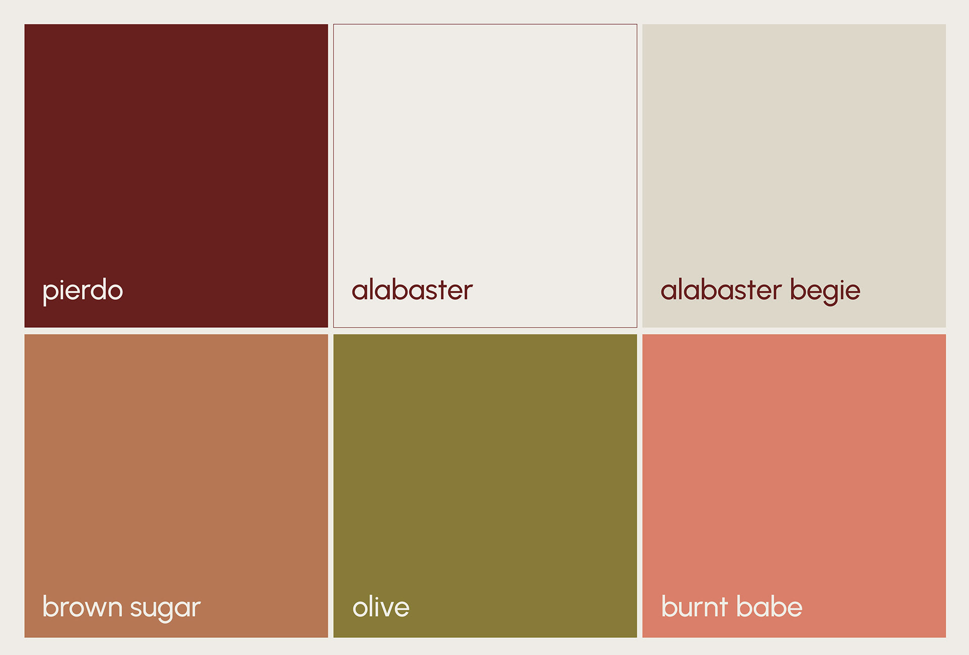
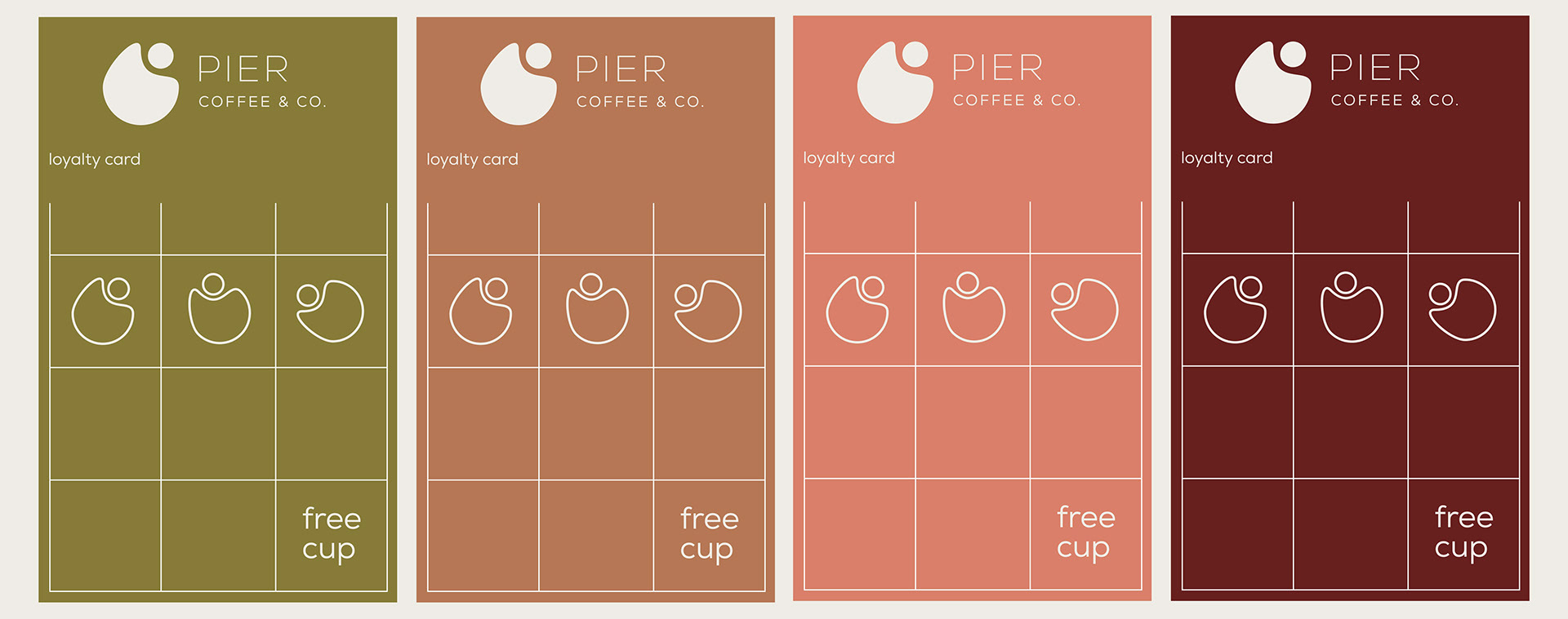
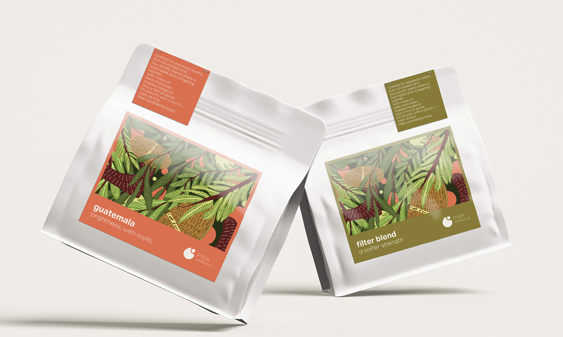
color palette definition, packaging systems, and tone of voice.
The design language embraces subtle contrast,
calm compositions, and tactile visuals,
aligning with the brand’s grounded and introspective nature.
Every element was crafted to reflect a sense of clarity, warmth, and stillness — values that guide the Pier Coffee experience from cup to communication.
